24 October 2025 · Myles Conti
Typography, Timing, and Trust: The Thinking Behind Our Rebrand
There's a strange anxiety that comes with changing a logo you've lived with for nearly two decades.
For us, our logo has sat at the head of every pitch, every film, every credit roll since 2007 — two white lines framing our name, a design that became part of our story.
But Conti Bros Films has always evolved. Over the years, we've adapted to new ways of making and finishing films — most recently through Xenon-Post, our dedicated post-production arm offering workflow and finishing services to other producers. At the same time, Conti Bros Films continues to focus on developing original IP, with the goal of bringing our first feature film to the screen in 2026.
In other news, next year will also see Karl and his family relocate to Western Australia, where we'll open a new office — extending our creative footprint from coast to coast.
With change in the air, a new look felt overdue.
Refining, Not Replacing
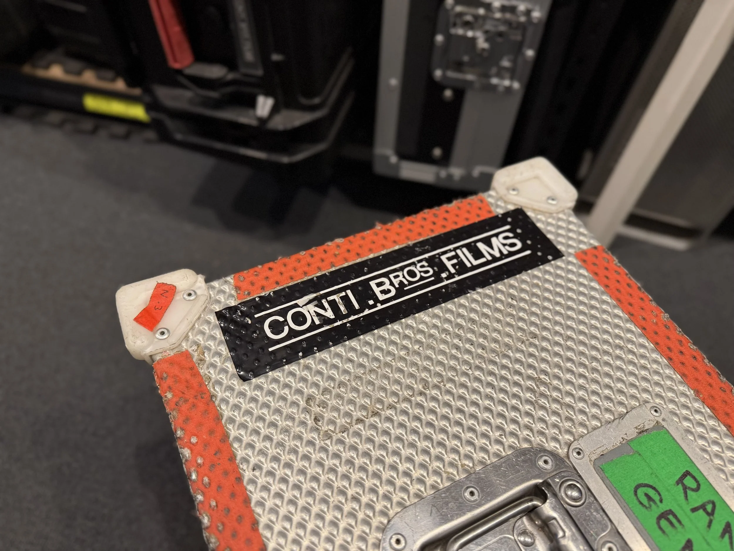
The old logo had a utilitarian charm — something that looked right printed on a flight case or scribbled on a clapperboard. But as our work matured, it began to feel tied to a different era. The aim wasn't to abandon it, but to refine it.
We wanted a mark that honoured what came before while reflecting who we are now: a logo that was precise, cinematic, and confident in its simplicity.
Designing for the Screen

The new design strips everything back to its essentials: three words, set in Bebas Neue — a modern, confident typeface — rendered in white on black.
The lettering has been custom typeset to refine its rhythm and proportion, creating a mark that feels deliberate and timeless on screen.
Looking Ahead
This refresh isn't about reinvention; it's about alignment.
After eighteen years, the work has evolved, and it felt right that the identity should too.
Same story. New frame.